


Description
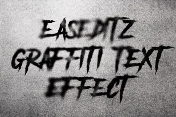
Graffiti Text Effect For Photoshop
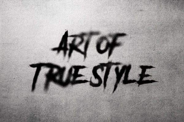
Graffiti represents a true rebellion in itself and has its roots far back, about several decades, in the urban setting, where street art saw some growth. At its root, graffiti was created by the poor as their tool to voice their feelings; they would narrate stories of things around them using this imagery and text. Over the years, it has grown from simple tags and throw-ups into a sophisticated visual medium that incorporates many styles and techniques. Today, the graffiti text effect has evolved into graphic design by drawing inspiration from these rich artistic traditions.
The graffiti style involves wildstyle, block letters, and stencil art among others. Each style has its characteristics, and it often portrays the artist’s personal touch and the cultural context where it belongs. With increasing demand for graffiti-inspired designs, many graphic designers now attempt to recreate the raw energy and dynamic composition found in traditional graffiti. This mixture of street aesthetics with modern design elements creates a graffiti text effect that works on all media, including digital media.
Digital graffiti text effects involve a lot of the designs made in software packages by companies like Adobe and make use of the programs, Illustrator and Photoshop. There are just too many tools in such software for color, typographic control, and layered composition to create the blending of graffiti techniques from an earlier age with more up-to-date design principles. Among them are such factors as the choice of color, for example; color can depict emotions in a graffiti work, yet the typography represents the idea or message meant to be delivered. It is when these elements harmonize within an accomplished composition.
The cultural and social context for graffiti remains crucial in this appreciation of the importance within graphic design. From graffiti’s origin as a medium of protest to its being considered an art form by itself, graffiti continues its influence on modern design. Its boldness and the authenticity of the graffiti text effect reflect this history with the challenge to designers in the interplay between an art form and a message while paying homage to graffiti’s roots in urban creativity.
Graffiti text effect
A nice graffiti effect can add an urban flavor or artistic touch to any graphics design project. With simple steps, this tutorial would guide you through popularly used graphic design software-whether you are a beginning designer or an expert-since the steps should all be easy to follow on.
First, prepare your workspace by opening your design software, creating a new project at the size of the intended canvas. The larger you make the size, the more intricate details can fit in there. With this project open, you are going to select an appropriate background color that you will use for the project. Darker shades tend to work well as it kind of serves as a wall for the city, leaving the text to pop through.
Then choose your graffiti-inspired font. Make sure to choose bold fonts that are very expressive and can be given the shape and flow of spray paint. Once you have your chosen font, type your message, then size it appropriately depending on your work surface; it is also where you can test layering fonts or placing outlines to give more depth.
Colour selection is imperative for an authentic graffiti appearance. Choose strong colours which would contrast highly with your background. Now that you have your colors, apply a base color to your text layer. To achieve spray paint, try using a wide variety of textures and brushes. The majority of the software offers brushes in the style of spray paint. Experimenting with different opacities and sizes gives your work an organic appearance.
Add shadows and highlights to your design. This will give your text depth and dimension. For shadows, create new layers using a darker shade of your base color and apply them in areas where natural light would be blocked. For highlights, use a lighter shade on the edges of your text.
Lastly, add a personal touch by using icons or dripping and splattering to make your work stand out in the best way. Most common problems such as making your design legible and creating a harmonious color combination will be avoided and corrected, thus ensuring that your end product stands out as art.

Reviews
There are no reviews yet.